
User flow, Wireframes, Visual Designs, Prototype,
Creative Direction And Product Management
Company: Korn Ferry
Duration: 10 months (3 Iterations)

This project unfolded across three focused iterations, transforming an outdated participant portal into a dynamic, user-friendly platform with enhanced functionality and interactivity.
I focused on improving the portal’s core features to make it easier and more engaging for participants. From tracking assessments to accessing personalized feedback and learning resources, the redesign ensures a seamless and user-friendly experience that supports personal growth.

The previous Participant Portal had an outdated design and lacked interactivity, making it difficult for users to navigate and access information efficiently.
Key challenges we addressed include:
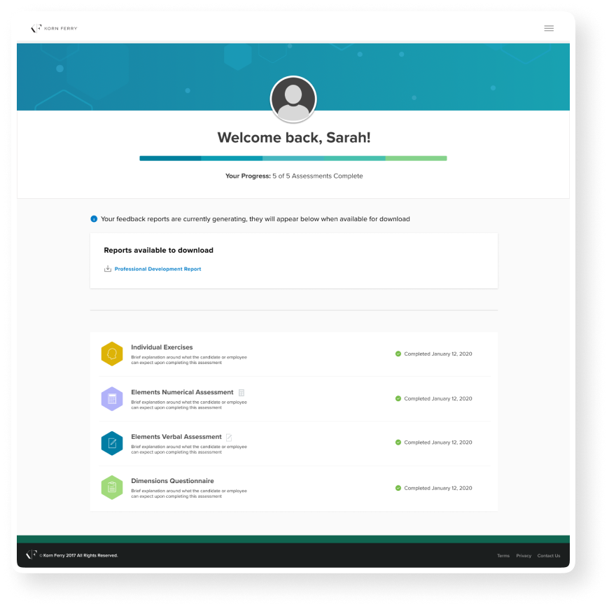
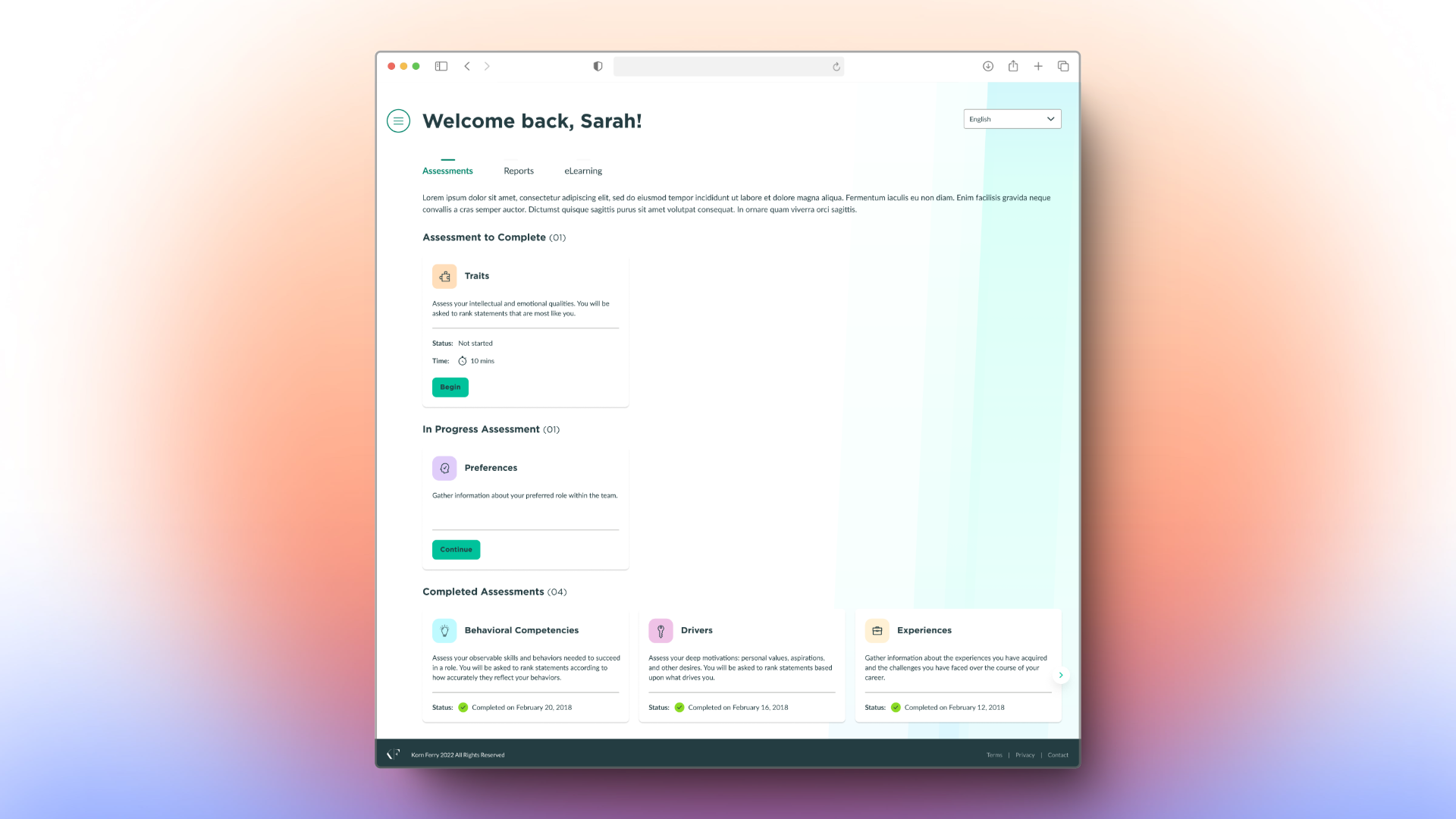
A single-screen view created cognitive overload by displaying too much information at once.
Learning materials were housed in separate tools, making it inconvenient for users to access relevant resources directly.
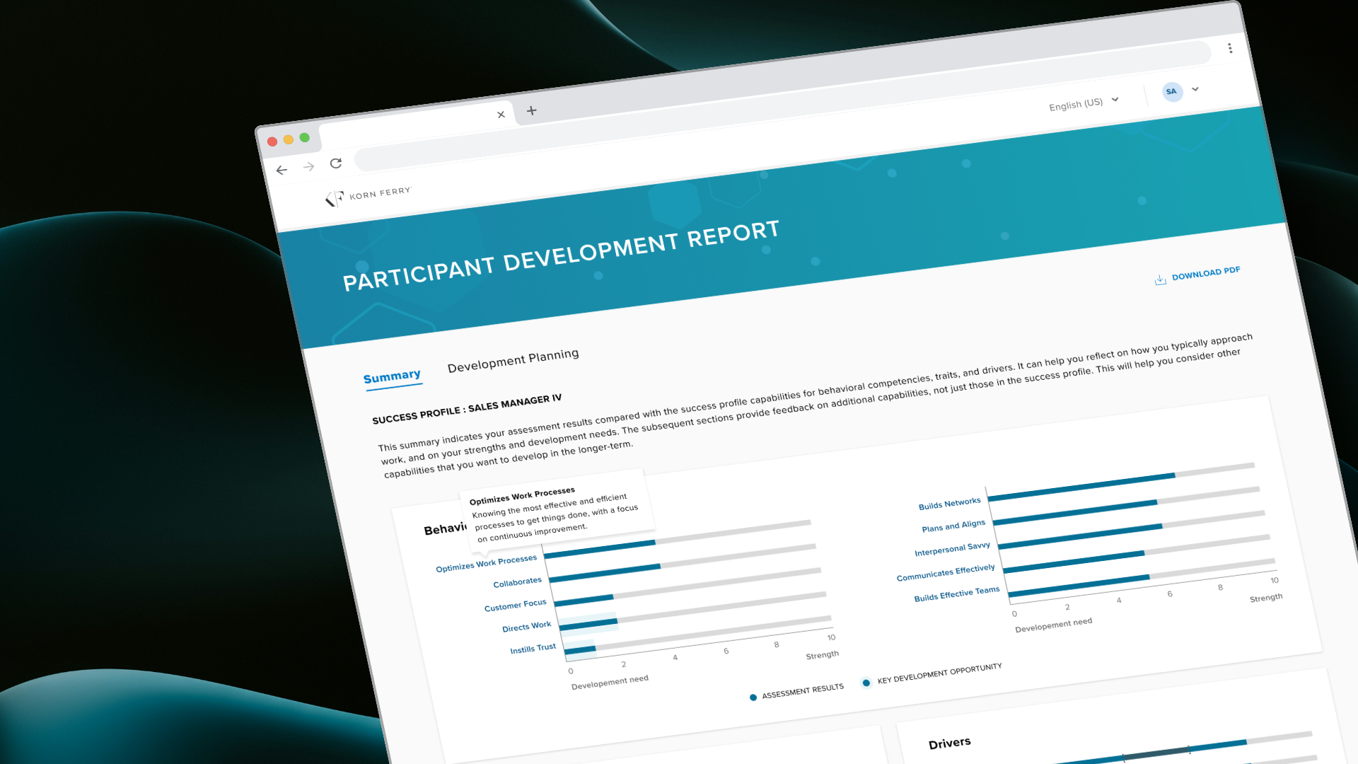
Users got reports as PDFs that were hard to understand and users had to keep going back to glossary to understand the keywords.
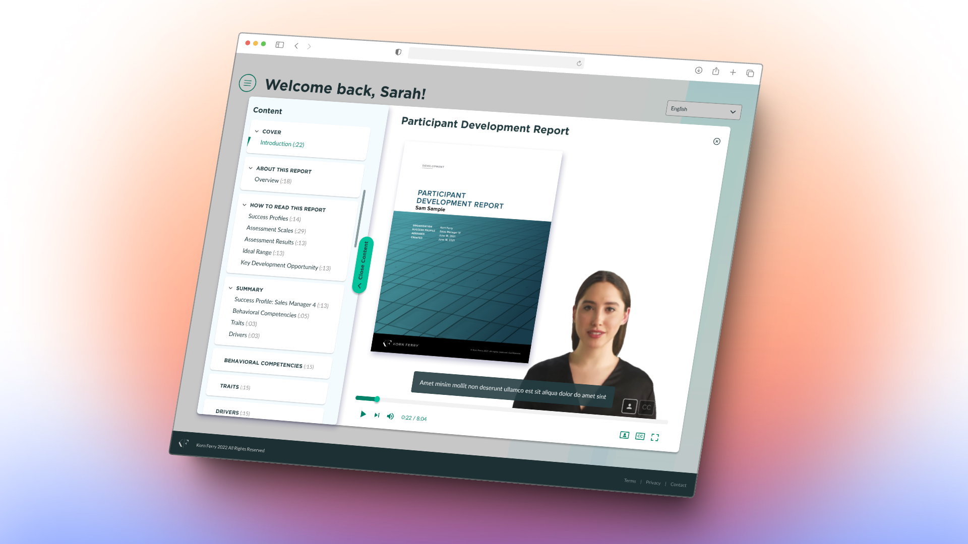
The first step was to tackle the outdated single-screen design and improve interactivity. Key enhancements included:
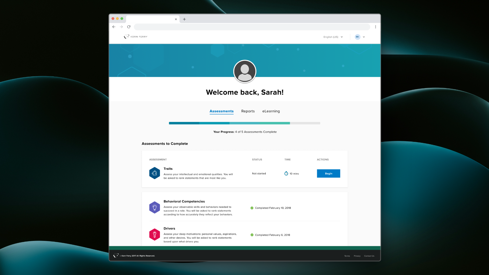
We reorganized assessments into separate categories— completed, in-progress, and available, reducing cognitive load and improving usability.
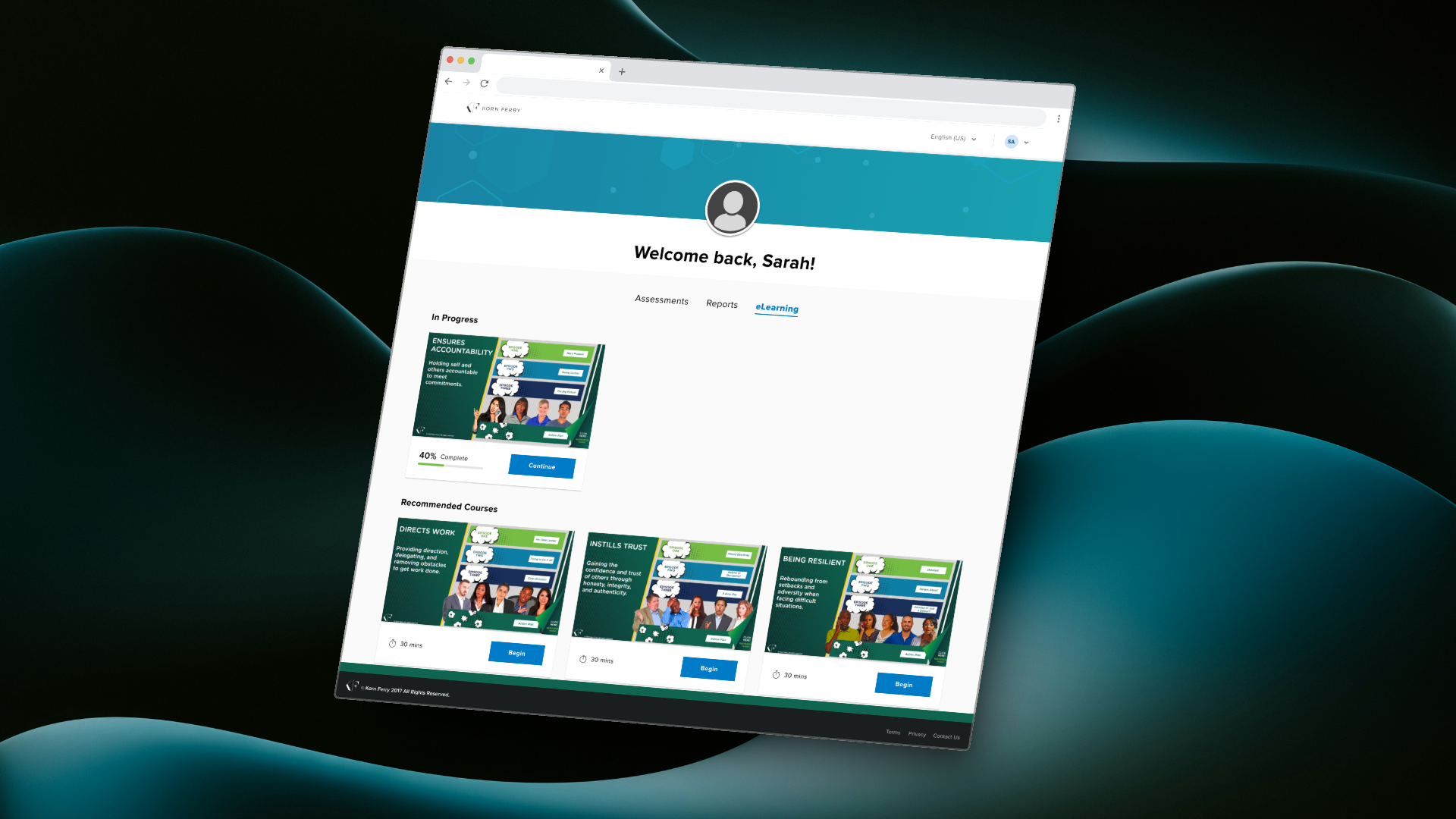
By embedding KF Learn Microlearning content into the portal, participants could access learning materials directly, without leaving the platform.
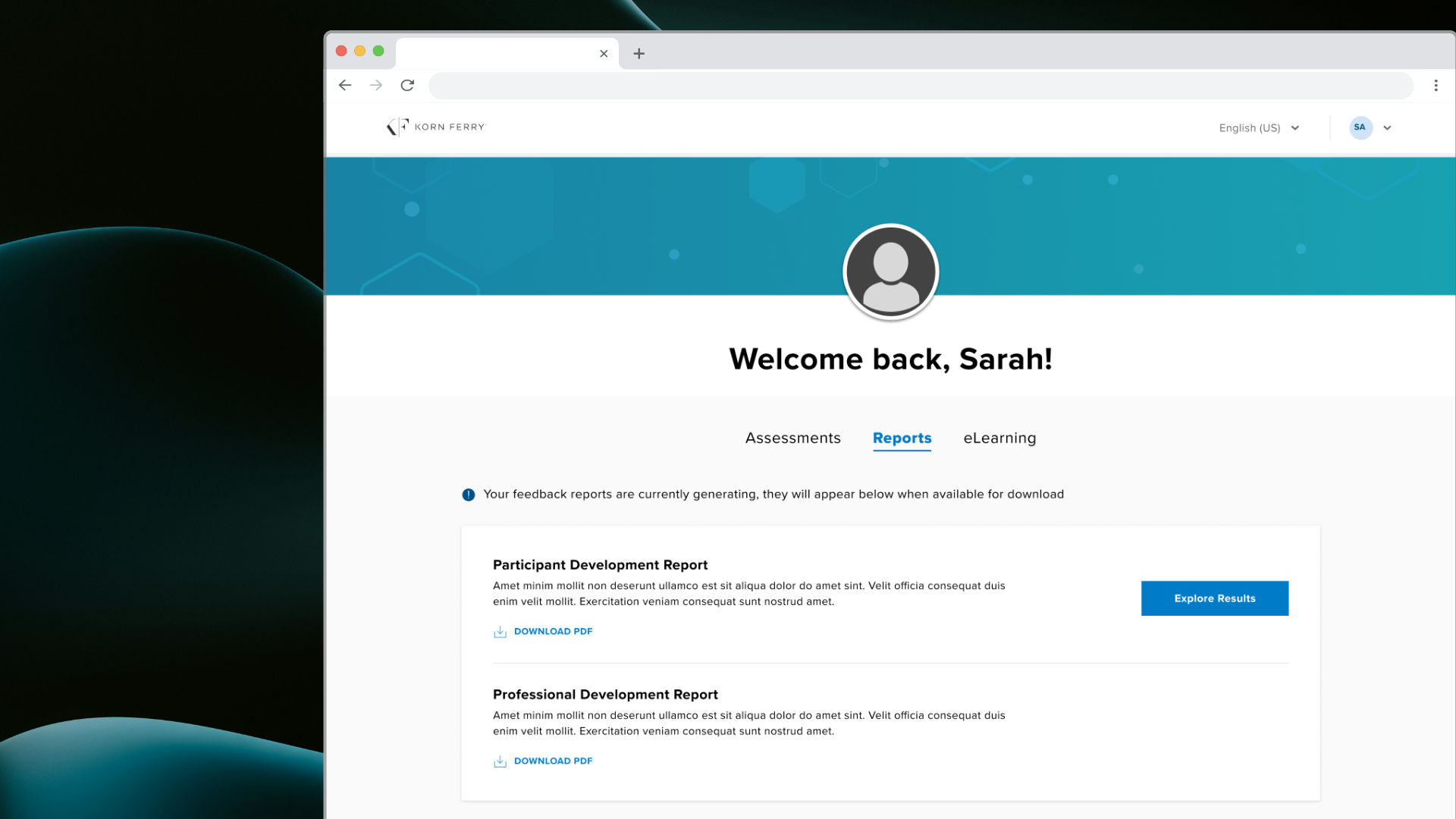
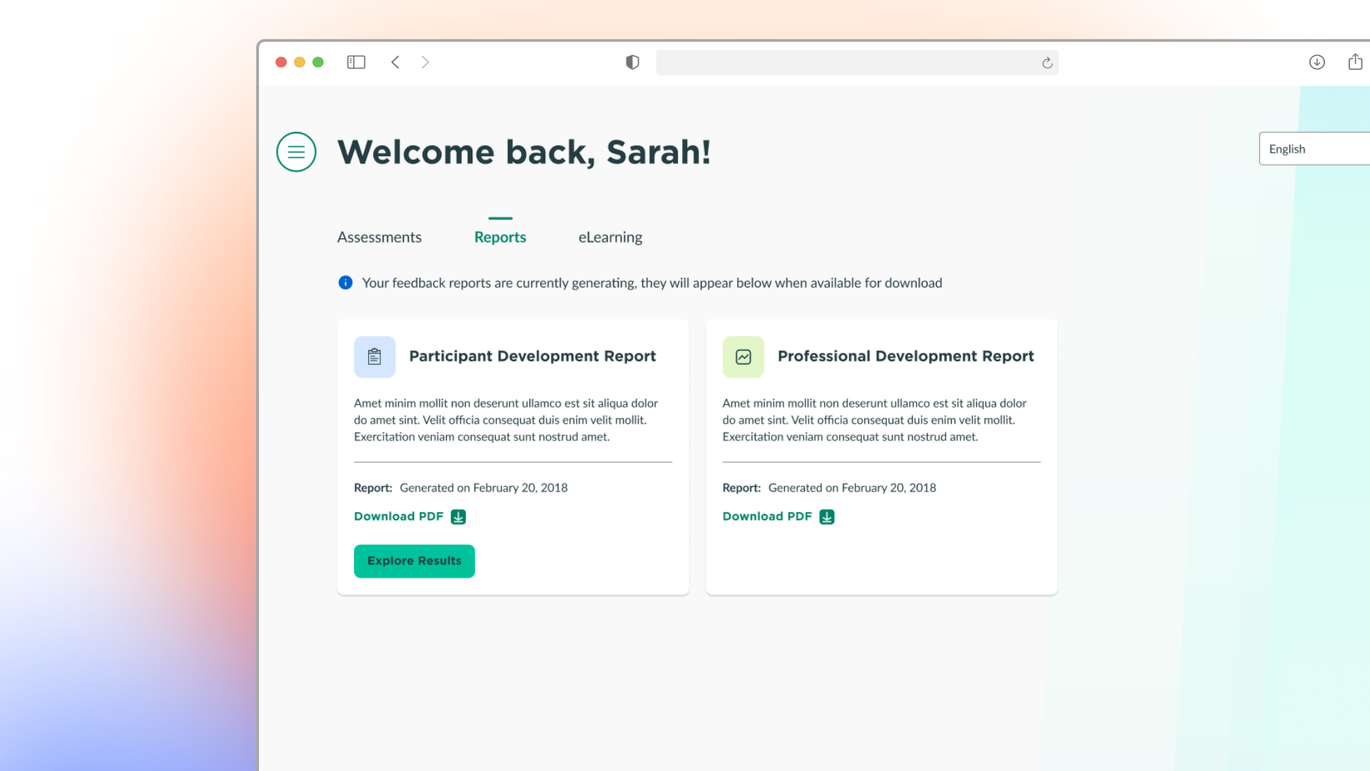
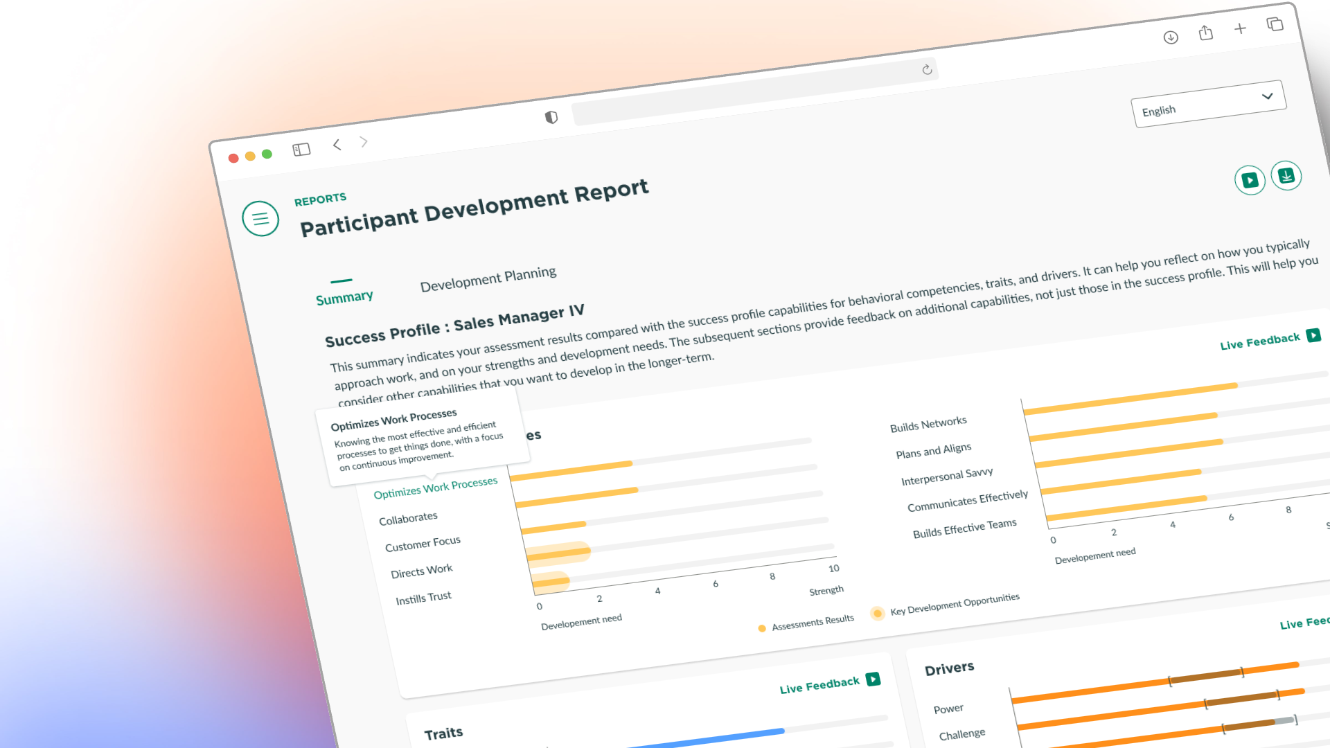
Reports were redesigned to include Sten graph visualizations and interactive hover-over definitions, providing deeper insights. Users retained the ability to download PDF versions of their reports.
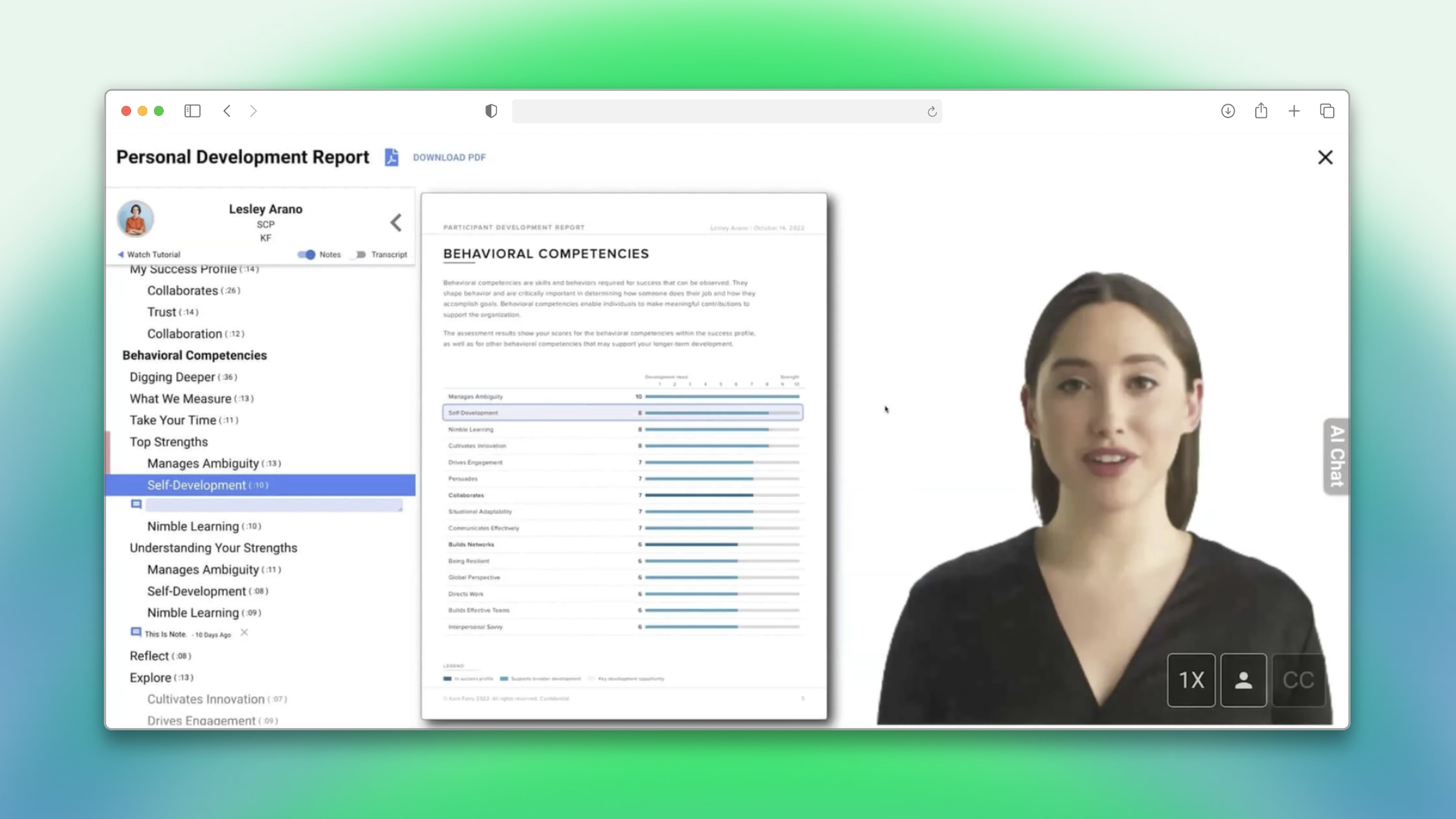
The second iteration focused on aligning the portal with a fresh design system, ensuring consistency and scalability. Key changes included:
All UI components were restructured to adhere to the new design standards, ensuring a cohesive and modern look.
We revamped the assessment section by presenting assessments in a card format, making it more visually appealing and easier for users to navigate.
Live Feedback narratives to provide personalized, real-time insights, helping users understand their strengths, areas for improvement.
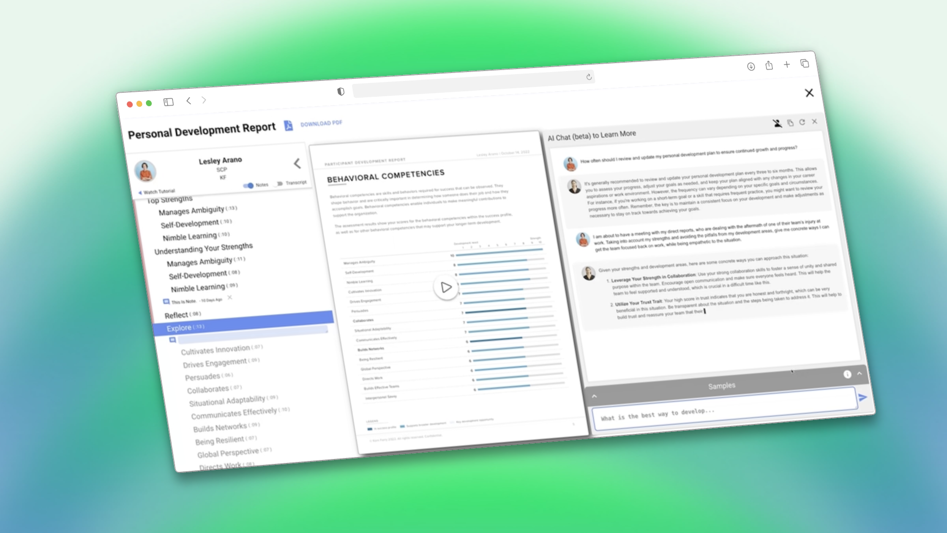
The third iteration focused entirely on delivering a smarter, more personalized feedback experience. Key updates included:
Enhanced real-time, personalized insights, providing users with actionable feedback tailored to their assessment results.
Introduced an AI chatbot to guide users, answer questions, and offer additional context for their feedback, making the experience more interactive and intuitive.
Achieved a System Usability Scale (SUS) score of 70, exceeding the industry benchmark of 65.
There is a huge increase in the numbers of daily active users, indicating higher user involvement and interest in the platform.